About 7 months ago, I felt a change was in order. I wasn’t showing up in Google well. I wasn’t getting a lot of traffic, and my website needed an update. I came to the conclusion that I needed to brand my website with my name and put my face on it. I decided to start be changing my domain from www.personalinjuryofnevada.com to naqvilaw.com.
Considering that I had been working off www.personalinjuryofneveda.com since I started my firm, I was concerned about switching. I had spent the last years building up my website with content and doing everything I could to show up in Google. I had three main concerns I needed to overcome before switching my domain:
- I was afraid I would lose the “sweat equity” I had built up in my old site.
- I didn’t want to start over with a new site.
- I was worried that my name would be too hard for people to pronounce.
Table of Contents
The House I Built
These first two are basically the same fear. I spent a lot of time with my old site. I blogged. I wrote new content. I treated it like a pet that needed constant care and feeding, investing a lot of my being into making it something that would produce leads and I could be proud of.
Here’s a picture of how the old site looked:
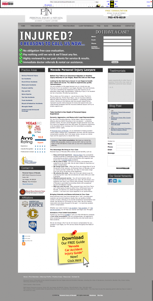
We then moved everything from the old site to the new site and lost very little of the equity I had built up.
The Pictures Make The Site
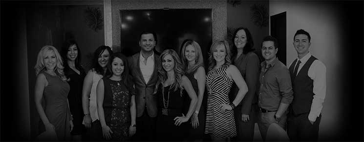
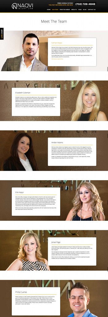
I knew that if making the switch to a branded site was going to work, I would need some awesome pictures to really show off our high energy office. So I hired a photographer to come take pictures of the office and our team. I wanted to show we are personable and friendly. We took over 200+ high quality photos.
It was these photos that lead to finding the voice and tone for my new site. I wanted to showcase our accomplishments and let our visitors know why we are one of the most capable law firms in Las Vegas.
Here’s what we came up with:
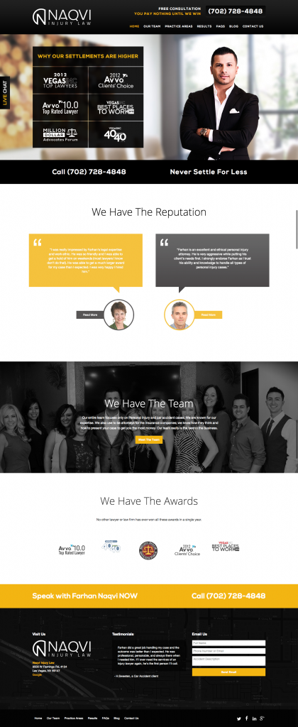
When you load this site, there is no doubt that it is mine. And, ultimately, when I saw this I knew switching was the right way to go.
As far as worrying about my name being hard to pronounce, I got over it.
Have I Looked Back?
Simple answer: No. However, I have noticed three distinct advantages to our new design that we didn’t have with the old design.
1. We Present A Confident Brand
2. We Give The Brand A Human Touch

3. We, As A Team, Have Better Ownership Over Our Brand
The New Domain Is Easier To Remember
I didn’t think this would be the case. Having an exact match keyword seemed to best the route for people to remember who we were as a firm. But we found that people remember us better because it is shorter than the other domain and because they can put a face to the name.
Risk Vs. Reward
In the end, I found that I didn’t need to worry about switching. My team has never been more involved or excited about what’s happening on the site.
We have reaped the benefits of branding our site and had none of the fallout I thought we would. And, to be honest, I’ve never been prouder to have my name on a website.